If you live in California, there’s a strong chance you’ve been obsessively checking Air Quality Index sites online to see just how badly you can expect to choke on smoke from nearby wildfires.
There are several places to look for AQI data, from the Environmental Protection Agency’s AirNow.gov, to the Sacramento region’s Spare the Air, and a newer AQI network called Purple Air. But how to make sense of it all? And why are the numbers sometimes different depending on what “conversion layer” you click on?
I asked Anthony Wexler, director of the Air Quality Research Center at UC Davis to explain.
Informed guesses
Let’s start with Purple Air. It’s one of the more ubiquitous companies making small, relatively inexpensive sensors that the average person can install to know their local AQI. The data goes into the cloud, popping up as a dot of real-time AQI on the online map that anyone can access. Unlike the state and federal air quality maps, it reports only particles, so doesn’t include ozone.
But Wexler said there are some very small particles its sensors can’t access. So the program uses an algorithm to estimate the current PM2.5 concentration, a part of the AQI. This helps explain why there are slight differences between the various “Conversion” types: “LRAPA” uses calculations from the Lane Regional Air Protection Agency, while “AQandU” estimates are from the University of Utah.
I tried to nail down Wexler on which conversion layer I should be clicking on for the best estimate, but he said that, ultimately, they are all an educated guess designed to give users a good sense of how healthy or unhealthy the current air quality is.
“They’re making a guess about the total concentration from part of the total story,” Wexler said. “It’s an intelligent guess, but it’s a guess.”
So, basically, click on all of them, and those at the EPA and local air district sites, to arrive at a general sense of conditions.

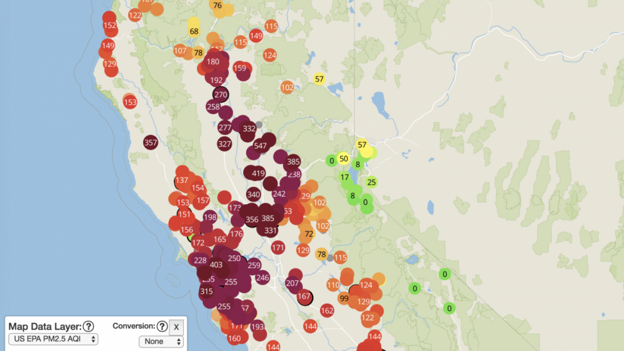
Purple (very unhealthy) and maroon (hazardous) air quality blankets the Sacramento and Bay Area regions on Nov. 15, 2018, as this map from Sacramento’s Spare the Air website shows.
Personal sensors
We also talked about the growing trend in personal air quality sensors, which anyone can pick up for their homes. While the EPA sensors are powerful and informative, the personal sensors can help fill in gaps where the more powerful ones aren’t located.
“The reality is that air pollution changes depending on where you are,” Wexler said.
If you live near a freeway or industrial facility, for example, your air quality is likely worse than your neighbors’ a few blocks away. And aside from smoky days, bad air quality isn’t always visible or obvious. So personal sensors can help fill in the gaps for people, especially those with health sensitivities.
But the quality of personal sensors on the market is currently a mixed bag. The EPA is currently trying to set some standards to offer consumers guidance.
In the meantime, Wexler said common sense is one of the most powerful sensors. He typically doesn’t even look at the AQI maps as part of his day, even during these smoke-ridden ones.
“I look outside and I go, ‘Oh geez, it smells like smoke, dammit.”
Then he takes precautions as needed.
Media Resources
Kat Kerlin is an environmental science writer and media relations specialist at UC Davis. She’s the editor of the “What Can I Do About Climate Change?” blog. @UCDavis_Kerlin.